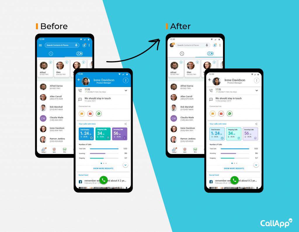
Have you seen (or better yet, experienced) CallApp’s brand new design? If you haven’t yet, well then, what in the world are you waiting for? It’s there within the app waiting for you, and we promise you – it’s not to be missed! The new look is not only incredibly aesthetically pleasing thanks to CallApp’s superhero team of designers (and guidance from Google’s Style Guide), but it’s also got tons of thought behind it too.
The idea behind this new, clean, sleek design is in fact to offer an improved experience to our users – once that’s less overwhelming, and in turn, one that’s even more efficient and productive than ever before. We know that you loved us before, but now you can love, appreciate and utilize us a little bit more.

CallApp’s added value, as you surely know, is that it’s far more than just a Caller ID app. It offers countless other unique features to provide the ultimate communication experience. But what this also means is that the app can get kind of busy and crowded in terms of the user interface. And for these very reasons, we came to the understanding that it was time for a lighter look – one that really allows you to just use the feature without being overwhelmed by bright colors. We, of course, we’re not going to get rid of your beloved features and services.
The new design isn’t so drastically different, as to not create confusion and the illusion that it’s a completely different app – but we’re confident that the small changes will make all the difference in your calling experience.
Continue reading
CallApp for Business, Bringing Verified Caller ID
There’s no doubt in the world that you’ve received a spam or scam call.
Fighting Spam Across Borders
There’s no doubt in the world that you’ve received a spam or scam call.


